Editorial
Logo and Identity
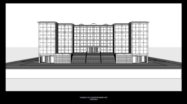
The MCA’s visual identity—unveiled on November 11, 2015, along with this redesigned website—is based on a design concept developed for the museum by the distinguished Dutch design firm Mevis en van Deursen and implemented by the MCA’s Department of Design, Publishing, and New Media. The identity features a grid, which refers both to the city grid of Chicago and the limestone and cast-aluminum squares that form the facade of the MCA; a color palette of black, white, yellow, and blue; and a new logo. It also includes a new suite of typefaces, developed for the museum by French designer Karl Nawrot. Keeping the concept of a grid in mind, Nawrot created the typefaces by combining squares to form a series of fonts—used in the video—that range from playful to classical and evoke our institutional values and our diverse programs.
As the video demonstrates, the new identity’s reach will extend beyond concrete visuals and will help clarify who we are—a museum that is smart, playful, and welcoming. It will also allude to who we are becoming—a contemporary art institution par excellence. We hope you love it as much as we do.
Explore Further
-
"Rating Chicago's museum websites"
Chicago Tribune -
"Chicago's MCA Unveils a New Identity"
Eye on Design