4 Things
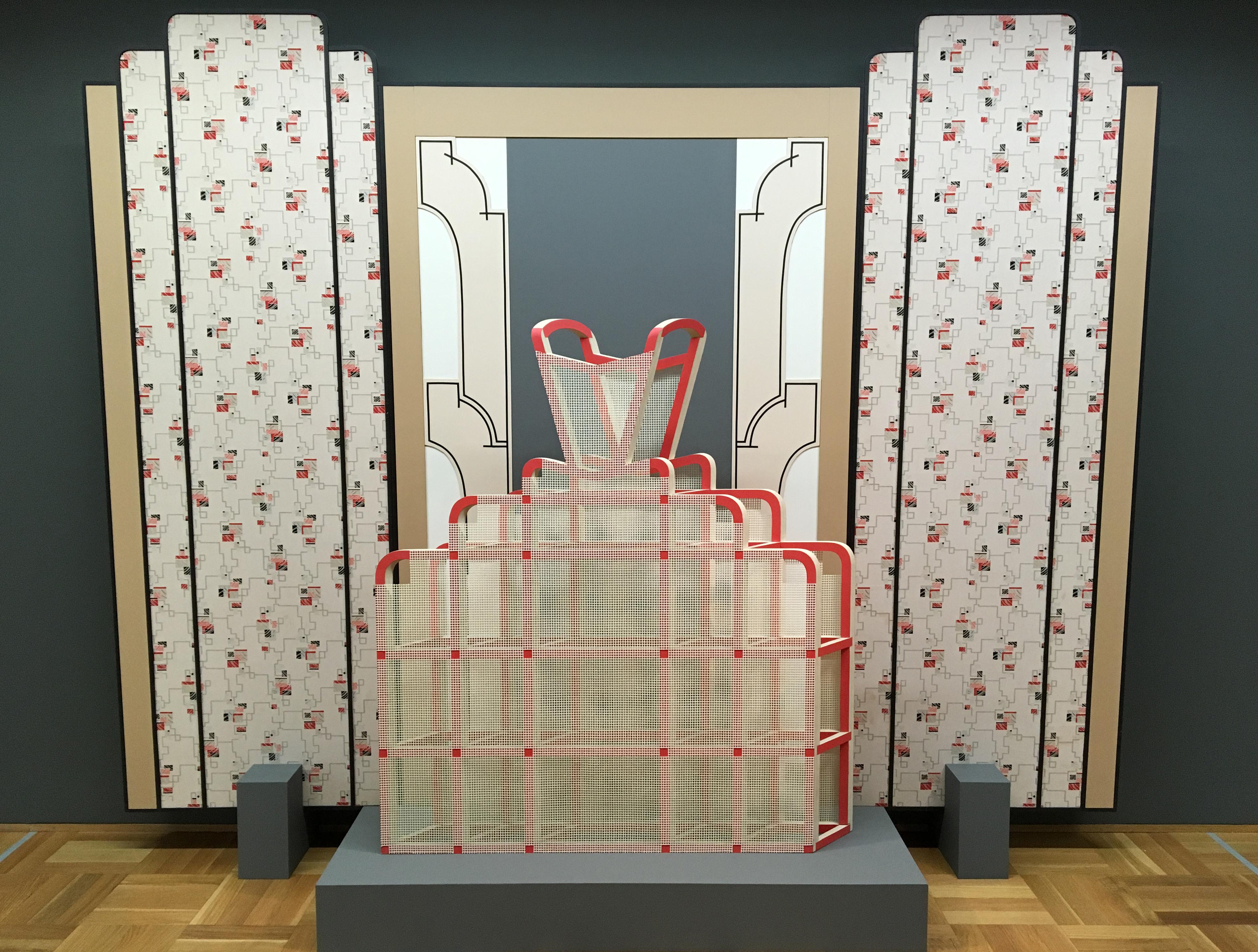
Installation view, BMO Harris Bank Chicago Works: Diane Simpson, MCA Chicago, Feb 16–Jul 3, 2016
Photo: Shauna Skalitzky © MCA ChicagoBlog intro
We asked Chicago-based artist Diane Simpson to participate in our 4 Things series by sharing four things that influence her artwork. See her work in the current BMO Harris Bank Chicago Works exhibition, on view through July 3.
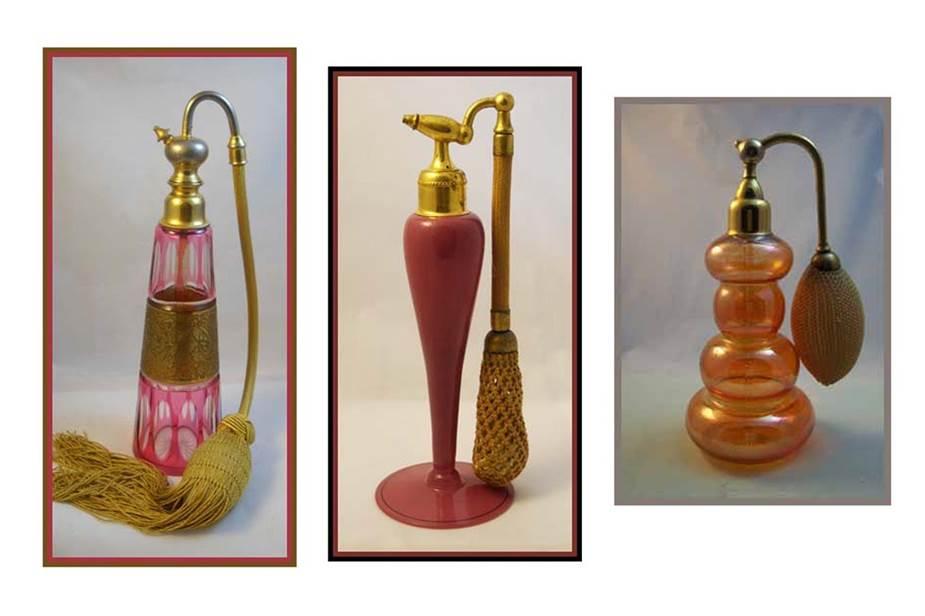
on perfume bottles
Perfume bottles, like the ones shown above, are designed with a variety of shapes, materials, colors, and opacities. Though the perfume containers all require the same individual sections (e.g. bottle, cord, tassel, pump) in order to serve the same function, they differ greatly. I like this marvelous variance on a theme. I can appreciate each bottle if viewed alone, but as a grouping, the comparisons are what I find most interesting. For my own work, I rely on objects from the “built world” that are visually meaningful to me. I look for the formal qualities of shape, texture, and pattern in an object, and examine how these elements work together to form a harmonious whole.
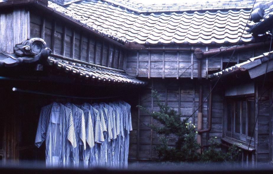
Inn at Ise, Japan, 1989
Photo: Diane Simpson, courtesy of the artiston japanese inns
Both of these photographs, taken on a trip to Japan, illustrate the famous phrase “form follows function,” coined by architect Louis Sullivan.
Outside an old inn in Ise, I was impressed with the pattern and tactile quality of the roof, which resulted from the repetition and positioning of identical tiles. From this view, I could also see a line-up of kimonos hanging out to dry, creating a similarly repetitive yet different pattern. The patterns were achieved with very different materials—one structurally solid, the other soft and fluid, yet in both cases, form followed function. Placed together, their contrasting materials and yet comparable effect, made the viewing experience especially memorable for me.
In my own work, soft versus solid materials play an important role. My sources have consistently related to clothing and my process of developing a form for sculpture begins with a specific image of a section of clothing. Through an extensive drawing process, the original shape and soft, fluid material of my source is abstracted, becoming more architectural in shape and requiring the need for a more structured and solid material.
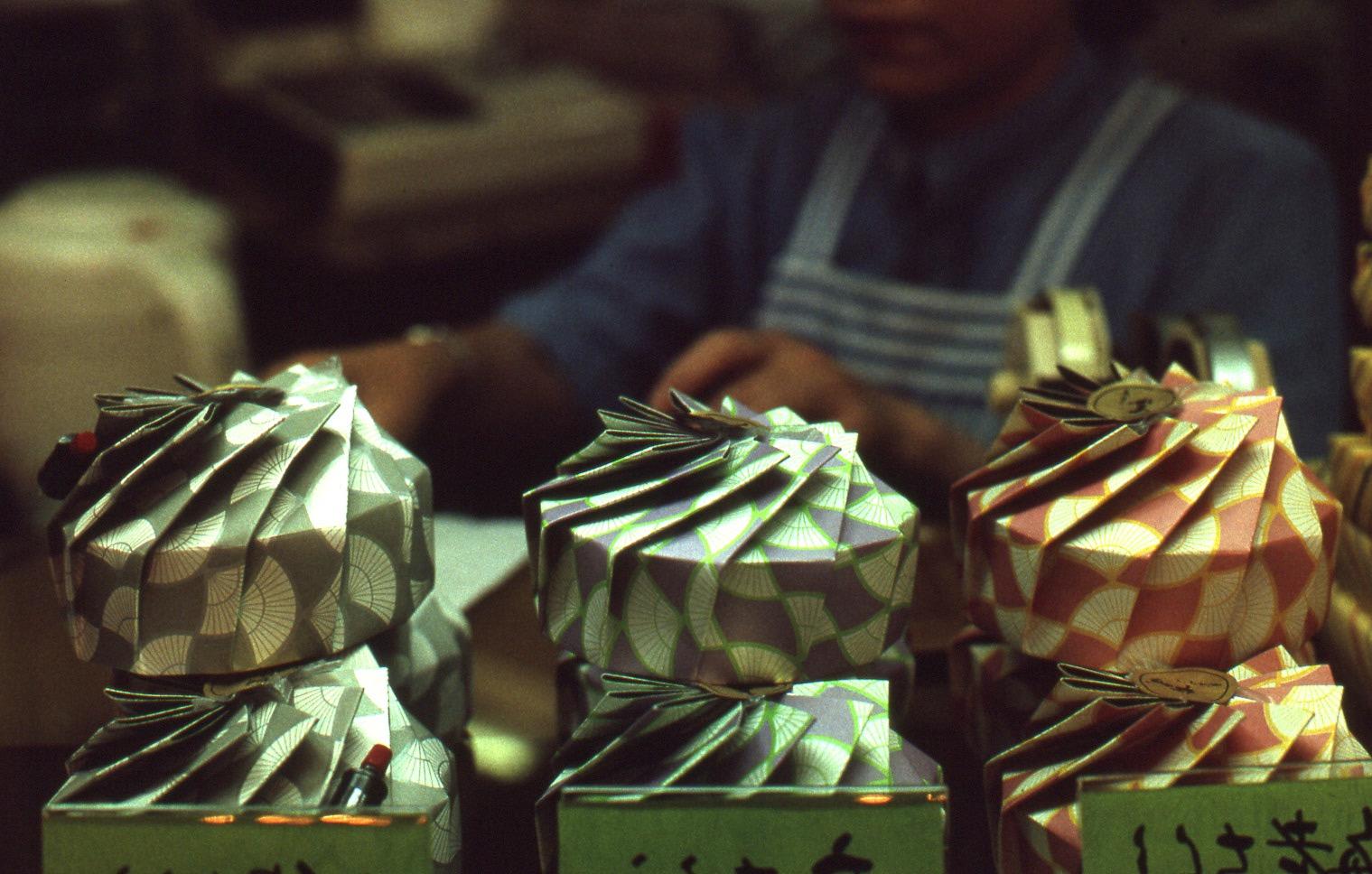
Food display in Japanese department store
Photo: Diane Simpson, courtesy of the artiston packaging
This photograph, which was part of a food display in a Tokyo department store, is an example of Tsutsumi, a traditional Japanese form of packaging. It illustrates the same principle of form following function. With both examples, I'm interested in how their shapes are not arbitrary, but instead are a result of the process of construction. As with my own work, process is not hidden, and shapes and surface embellishment are an integral part of the structure.
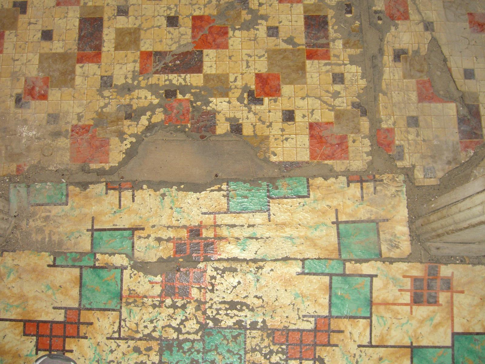
Linoleum patterns, 2011
Photo: ramsbee, some rights reservedon linoleum
I'm starting to realize how influential my memories are in relation to my choice of sculptural materials. As a child growing up in the mid-forties, I clearly remember a geometric art-deco linoleum pattern on my kitchen floor. I was determined to hunt down a similarly patterned linoleum to use on a particular sculpture. The sculpture, Apron III, suggested a figure and included a mid-section that might reference both a serving tray and a section of clothing called a peplum. My choice of color and high-gloss paint finish for this sculpture was reminiscent of that early kitchen. For the sculpture's mid-section, I was hoping to find a piece of vintage linoleum with the geometric pattern I remembered on that kitchen floor. It suddenly dawned on me that I had seen a very similar pattern loosely covering a small closet in the attic of my current 1920s house. It was a truly “eureka!” moment. I managed to salvage just enough of the well-worn linoleum to cover two areas of the sculpture.
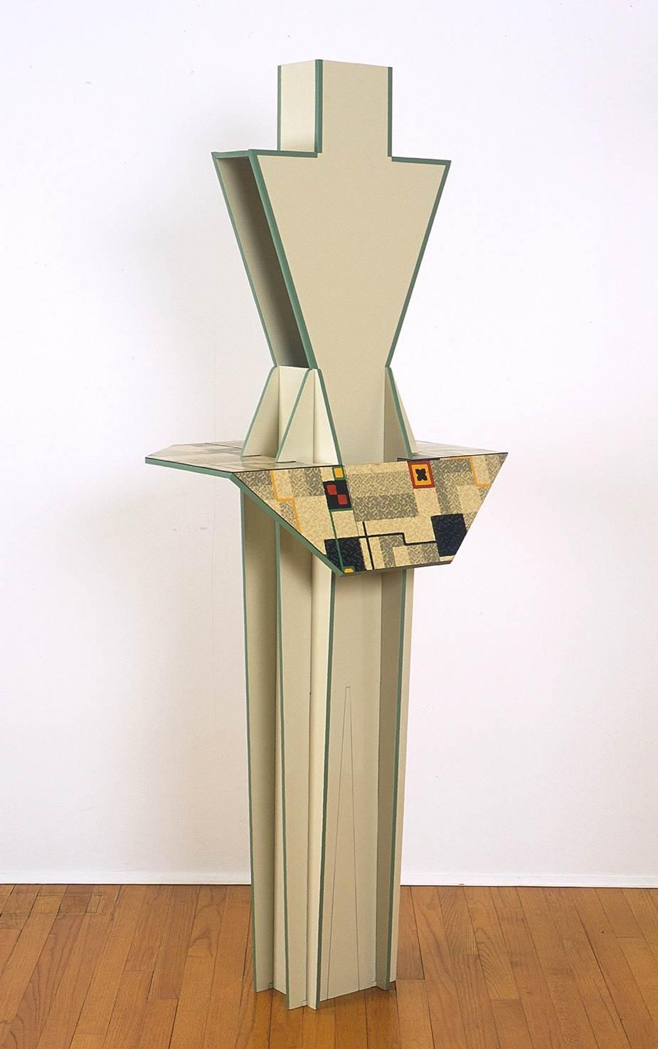
Diane Simpson, Apron III,
2001
on wallpaper
While searching on the web for materials from the deco period for the Window Dressing project, I once again experienced a serendipitous moment. I found a place in New York City that sold vintage wallpapers and linoleum. They had several rolls of original 1928 wallpaper almost identical to that same linoleum pattern. It was the perfect solution for one of the Window Dressing backgrounds.
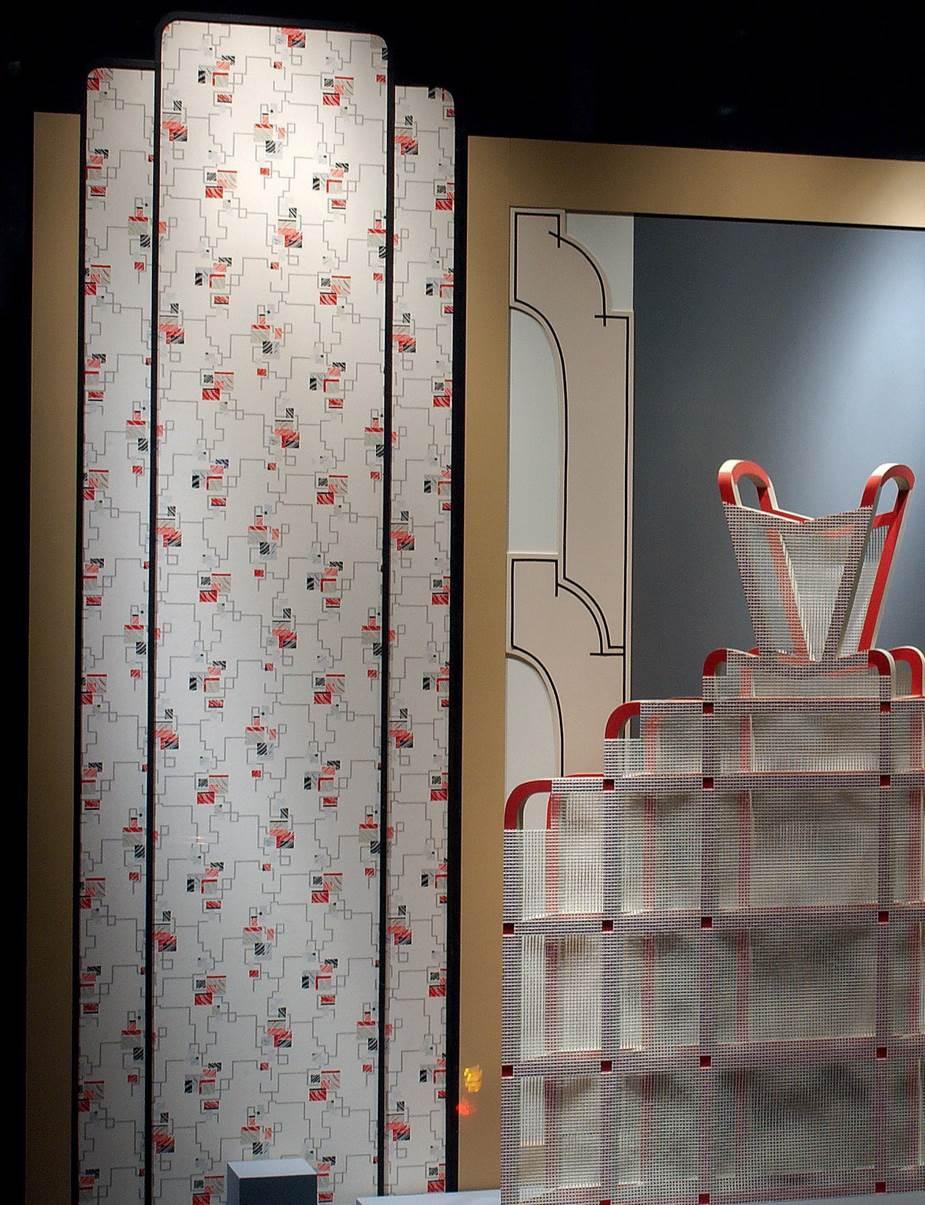
Diane Simpson, Window Dressing - Background 3 (detail), 2007
Image courtesy of the artist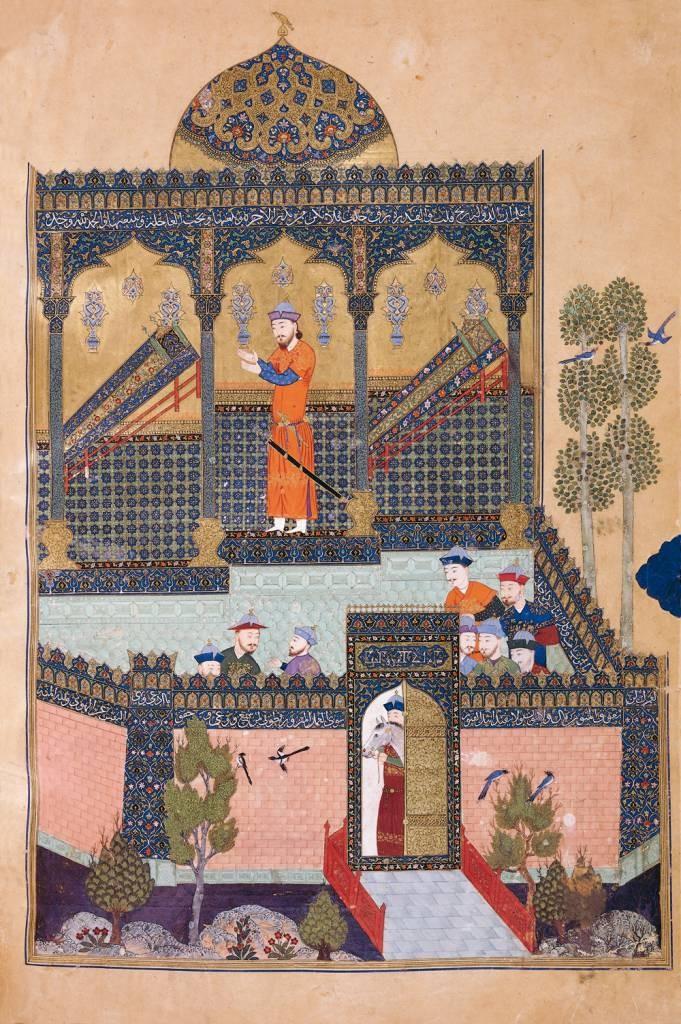
Excerpt from the Shâhnâmeh, c. 1430
on medieval perspective
I have a keen interest in the way space is described in Indian and Persian miniature paintings. This pre-Renaissance system of parallel perspective, with its oblique tilted planes, creates a shallow space and the feeling of a bird's eye view. To me, it feels very immediate and also a bit ambiguous and disorienting. For my preliminary drawings for sculpture, I have adopted a similar type of perspective, using parallel angles going back in space. It allows me to clearly develop a form on paper that can then be directly transferred to the three-dimensional construction. An example of this type of perspective can be seen in my drawing Cradle Forms.
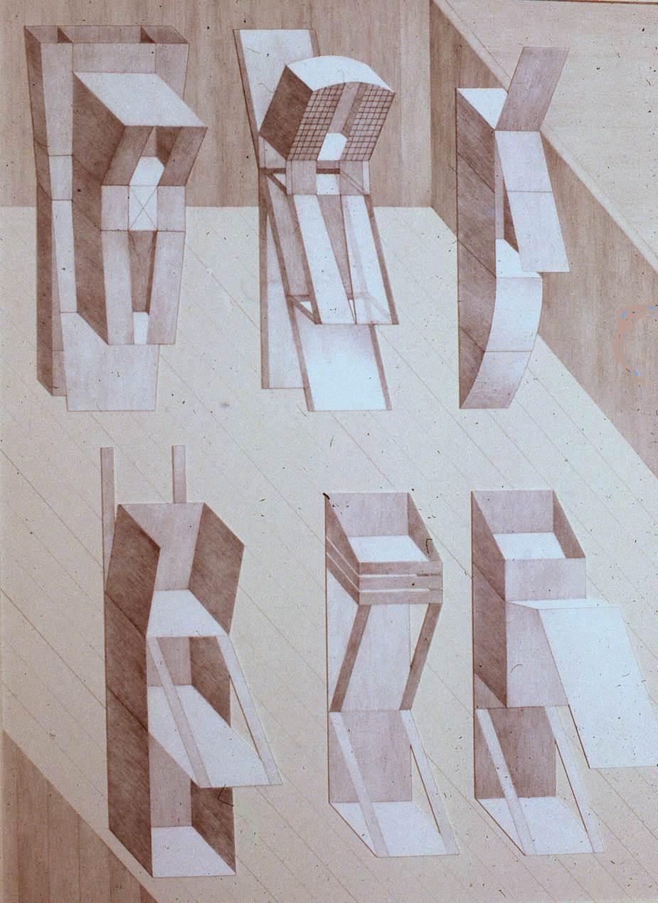
Diane Simpson, Cradle Boxes, 1977. Graphite on ragboard; framed: 40 1/2 x 32 1/2 x 2 1/4 in. (102.9 x 81.3 x 5.7 cm); unframed: 40 x 32 x 1/2 in. (101.6 x 81.3 x 1.3 cm). Collection DePaul Art Museum, gift of John and Mary Gedo, 2009.156
Image courtesy of the artist