4 Things with Faheem Majeed
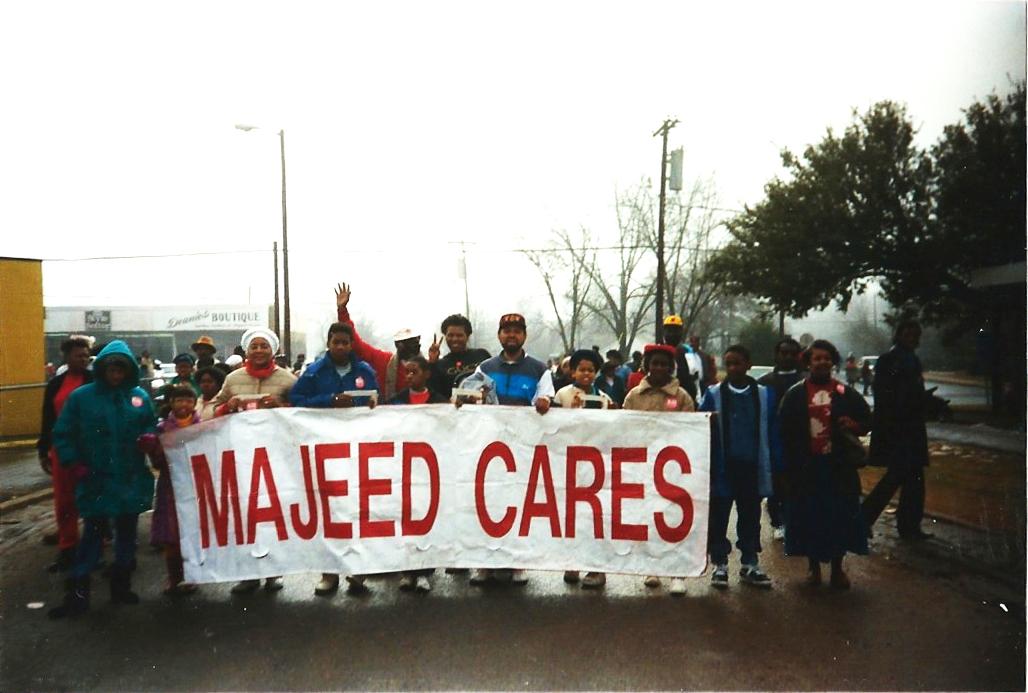
Majeed Cares parade in North Carolina
All photos courtesy of the artistWe asked Chicago-based artist Faheem Majeed to participate in our 4 Things series by sharing four things that influence his artwork. See his work in the current BMO Harris Bank Chicago Works exhibition, on view through August 16.
“Majeed Cares”
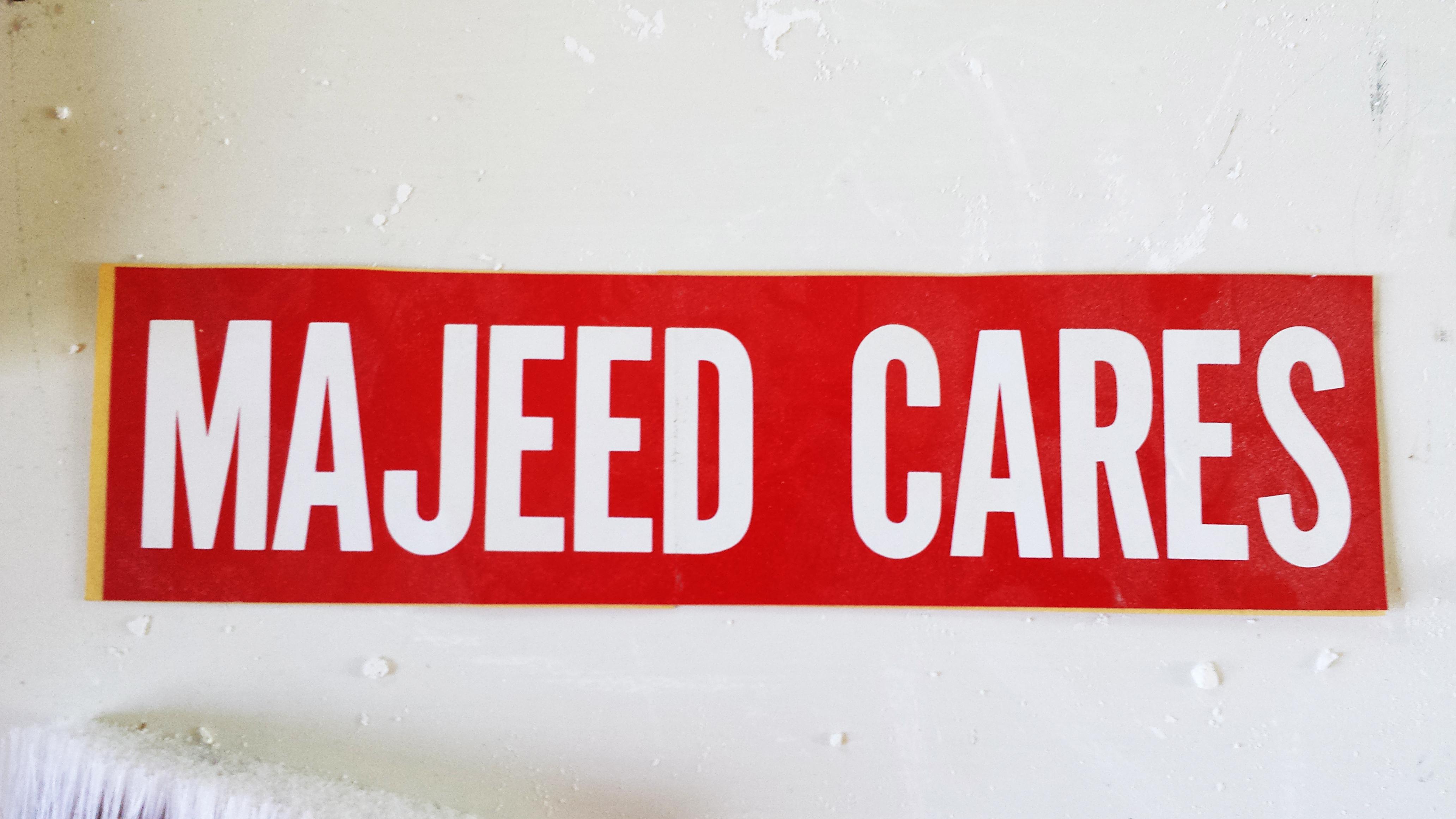
Majeed Cares is a series of work that comes from a slogan that my father used. He is a politician in North Carolina and I grew up on the political trail. It started when he was running for city council in Charlotte, North Carolina, and that was the slogan. There were bumper stickers, signs, and parades and all types of things to get him into office. My father was very ethical and people really believed in that slogan. You can still go to North Carolina and see those bumper stickers on peoples' cars. It wasn't unusual for me to grow up seeing my image or name on a street sign, or a handbill. I thought that's how every child grew up and I thought that was normal.
About the work
It isn't until now that I started thinking about it. The imagery comes from my father's campaign, and his image, but it's actually more about me, thinking at this moment of what is my impact in the neighborhood I live in, both as a person, and what is the impact of my art in that space as well. My mother was a social worker in the Minneapolis/St. Paul area, and my father is a politician, so the name Majeed means something to a very specific community in each one of these places. Majeed Cares is a biographical piece, it's about thinking about how our work impacts people. It's a big part of my life, my childhood.
on wood panelling
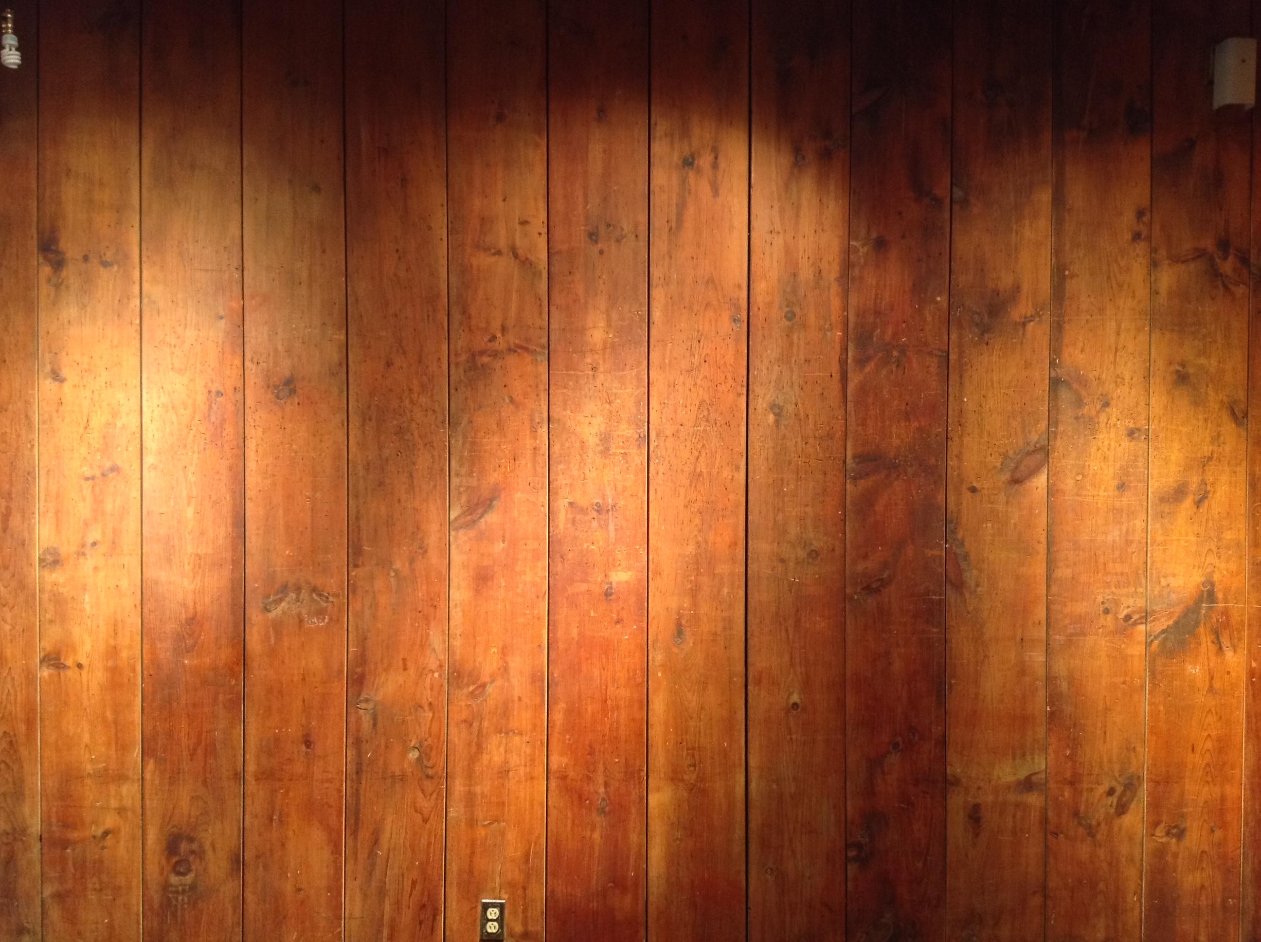
The wood paneling in the South Side Community Arts Center was a part of the Chicago New Bauhaus intervention in the 1930s. When you come into the gallery you see wood panels that are reminiscent of a basement from the seventies, like That ‘70s Show basement. Any administrator that has some control, the first thing they want to do is cover up the paneling because it is a horrible option for a gallery, and this is the main gallery space. The first thing they want to do is make it a blank space, which is what most galleries do. They disappear.
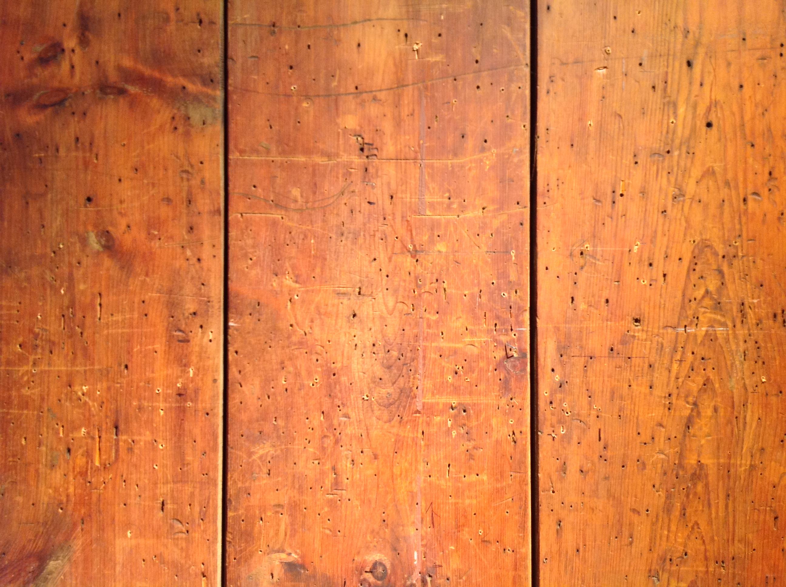
But in this space, no matter what you do, the walls, the dark walls, overpower anything in the space. It’s like a womb. Once I understood the significance and the value of being different, in having this kind of diverse gallery space that functions completely opposite of what most galleries do, it becomes unique, which was the design. It’s this kind of German-inspired interior, from the Chicago New Bauhaus, that’s occupied by a predominately African American art space. So it’s like German with some soul, you know?
But the idea is that the paneling absorbs anyone that comes through there through the markings of hanging paintings. The scratches and scrapes, staples, nails; it’s just kind of this timeline, this didactic timeline of usage, which is really beautiful. Once people understand that, the space changes. So people that have been in the space for 50 years, when your able to articulate that idea, those people say, “This is my first time I’ve been in the space, I’ve always hated these walls, and now I understand why they’re different, why they’re important, why they’re special.”
There are spirits in this space. And it’s because of what people have left, it’s the residue. The residues of a great ideas.
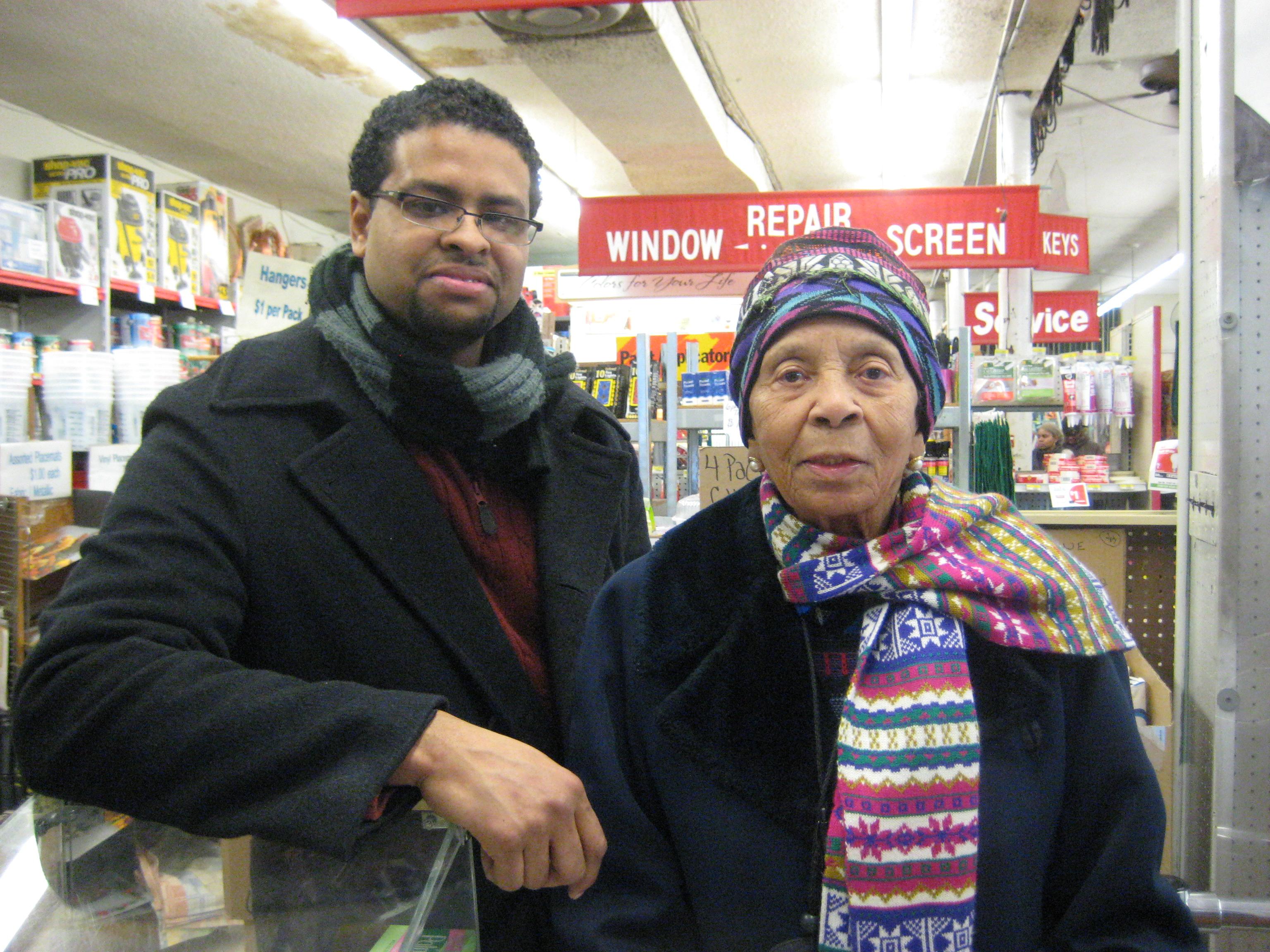
Artist Faheem Majeed with Margaret Burroughs at Ace Hardware
on Margaret Burroughs
Margaret Burroughs is the matriarch. She's the founder of institutions, the DuSable, the South Side Community Arts Center, and others. She committed her life to education and supporting others. Shortly before she passed, she said, “When I die, I want my last check to bounce.”
Despite being a founder, being the matriarch, she was also very accessible. I would see her walking up and down the street with a shopping cart, little basket, going to Save-A-Lot, taking the bus. She’d hop in your car and say, “Take me to the bank.” And she wasn’t necessarily regal in the sense that you think of a queen or something like that. She was a queen, but she had a fishing cap. She would carry a handful of her prints, Xeroxed copies that she would hand out, and she didn’t look any different than anyone else on the bus stop.
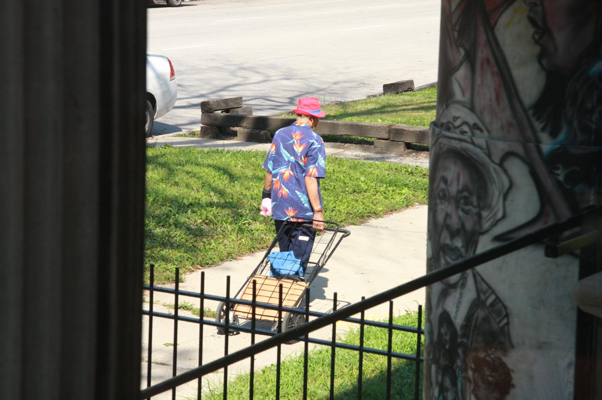
Margaret Burroughs
She was an artist, a printmaker. She was known for these wood block prints that looked very much like the Mexican Muralist style from the 1920s.
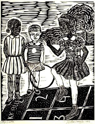
Margaret Burroughs, Hop Scotch, 1996. Linograph
on Burroughs’s prints
Everyone has them. They’re all over. For each one of those prints that you see in a school or crammed away in someone’s house was a moment when she had an engagement with someone—she didn’t have a distributor. They represent a moment when she touched someone. But they were copies themselves, Xeroxes of the print. But she wasn’t worried about the authenticness of it. She was worried about having enough to give away.
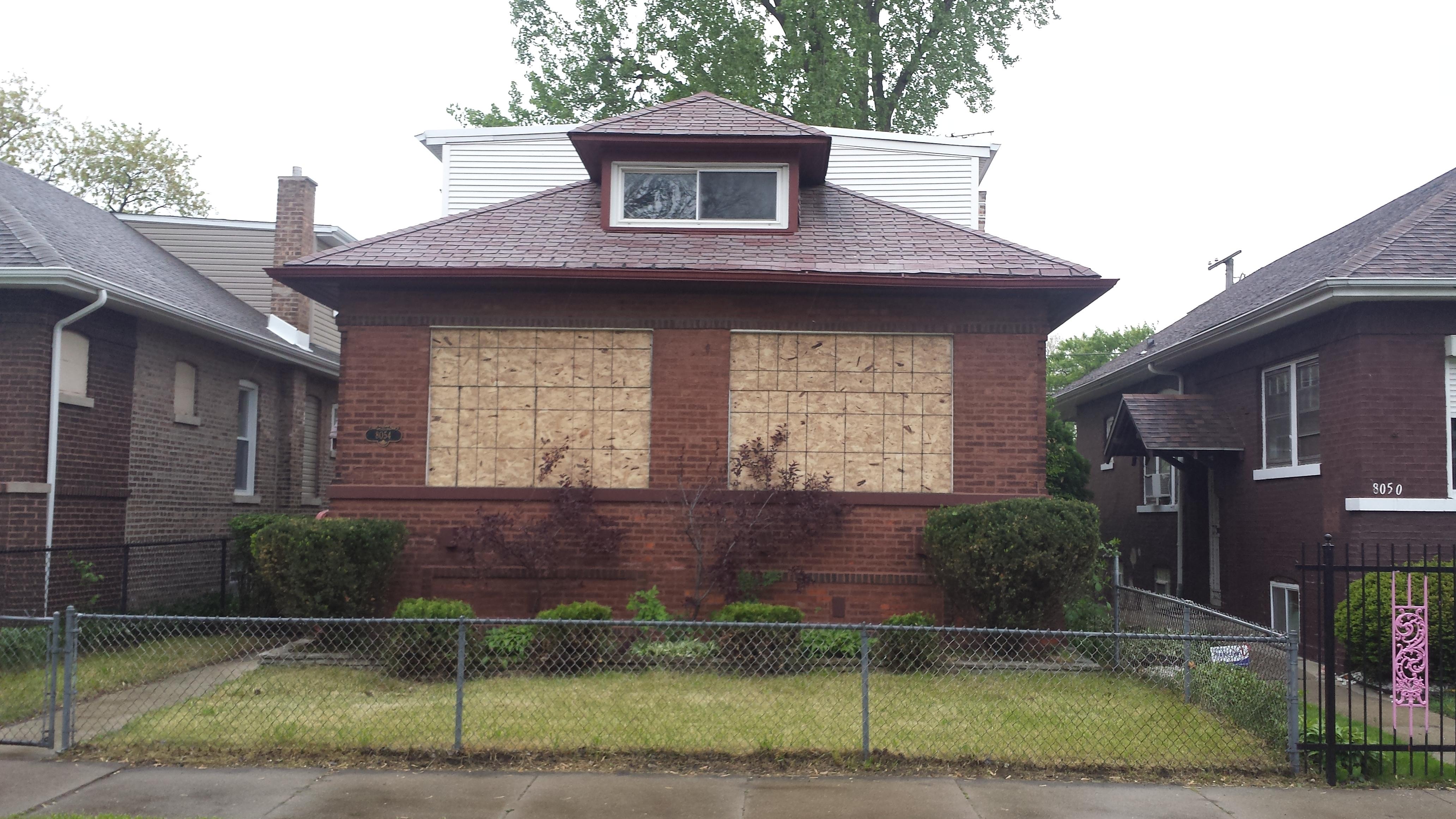
on boards and buildings
Boards and buildings: that’s really just kind of like South Shore and boards are very familiar in my neighborhood. As the space changes, as people who can’t afford to live there move out and people who can afford it start to move in, people get pushed out.
In social practice art, right now, the gentrified neighborhood is a hot topic. It’s blacks and browns being pushed out to make way for a more polished kind of communities. But often times that conversation oversimplifies things. When people talk about it, it’s just: gentrification is bad. It’s not. Gentrification is not bad. It’s a word. It means change, right? But when you see these neighborhoods that are boarded up, think about who lived there, you think about the people being pushed out for whatever reason.
But I see the boards a little differently. I see them as possibilities. I see a cocoon. Once that particleboard comes down, then there’s something else there. It’s potential. The cocoon comes off, and maybe the butterfly is there. Now, who moves in the spaces? Who benefits from it? That’s another conversation.
That particleboard is also a pattern, which in the right light begins to look like a painting. It reminds me of Jasper Johns, or Jackson Pollack maybe. It has that layered-ness. But it only looks like that because I put it on the walls in the gallery. A lot of people kind of looked at the work and said, “I never really thought about that as an object, I never really looked at the design on those. All I think about is the function of it. The function of it is something you see all over the city, vacant lots or whatever, just kind of a discarded material that’s really inexpensive and easy to come across.” It’s a great metaphor for value, taking something that’s maybe a castoff, or overlooked, and then framing it in a certain way to see the value. It’s a very simple material, but there’s a lot of layers in presenting it that make references to a lot of different things.
As told to Abraham Ritchie and Shauna Skalitzky